Esther Stocker [IT]. o.T. 2017.

Acrylics on canvas,
20 x 20 cm.
Series of 10 unique paintings

8 works available

Price progression: with each sale
+ 50 € net
Currently: 800,00 net + 152 VAT = 952 €

Carlo Battisti [IT] – AU CONTRAIRE, 2020

AU CONTRAIRE (Point de Vue), 2020

Dimensions [closed]: 7,5 x 7,5 cm
Number of sheets: 4, total pages 8.
Technique: mounting of the acrylic mirror with letterpress support with hand press on handmade paper of 360 gr/sqm.
Edition: 33, individually numbered and signed by the author.

Edition „Il Bisonte“ [printing of etchings and lithographs of world renown] Florence [IT].
Authentication with dry stamp „Il Bisonte“.

Edited in August 2020

100 EUR + VAT

Carlo Battisti [IT] – ME/WE, 2020

ME / WE, 2020

Dimensions [closed]: 7,5 x 7,5 cm
Number of sheets: 4, total pages 8.
Technique: mounting of the acrylic mirror with letterpress support with hand press on handmade paper of 360 gr/sqm.
Edition: 33, individually numbered and signed by the author.

Edition „Il Bisonte“ [printing of etchings and lithographs of world renown] Florence [IT].
Authentication with dry stamp „Il Bisonte“.

Edited in August 2020

100 EUR + VAT

Cedric Christie [GB] – Eight Embroderies.

Disciples of History, 2021.
Silk embroidery on cotton canvas,
39 x 42 cm.

Imi Knoebel
Piet Mondrian
Yves Klein
Jasper Johns
Rodchenko
Albers
Francis Bacon
Matisse

Each edition of 12 plus 3 E.A.
Signed & numbered on side of stretcher

800 GBP / 935 EUR net
Will be shipped from Great Britain!

Nils-Simon Fischer [DE]. August 2017.

  1. 11. August 2017. Mönchsberg 34, 5020 Salzburg.
  2. 13. August 2017. Mönchsberg 34, 5020 Salzburg.

Both silkscreen on paper on MDF,
35 x 51 cm
Unique prints.

each 500 + 95 VAT = 595

___EN___
Comment by the artist

Every day we absorb and participate in the creation of information.
Accordingly, personal, public and political spheres overlap every day. So what happens during this everyday process and what might it look like?

In my drawings, I usually record received actions and actions in real time onto a pre-determined grid, box by box. The boxes are thus occupied by signs or – in the case of a pause – expressed as blanks. In these transcriptions, my transcriptions, my impressions are encoded through rhythmic lines and signs which I also combine with traces of concrete messages and utterances I receive.

My process is bared by me making all these events visible on paper.
Beyond the drawing aspect, I deal with themes of time, space as well as the body; aspects that define the perception of each specific moment.

___DE___
Werkkommentar des Künstlers

Jeden Tag nehmen wir Informationen auf und beteiligen uns an der Erstellung dieser.
Entsprechend treffen persönliche, öffentliche und politische Sphären täglich aufeinander. Was passiert also während dieses alltäglichen Prozesses und wie könnte das aussehen?

In meinen Zeichnungen fixiere ich in der Regel wahrgenommene Handlungen und Aktionen in Echtzeit auf ein vorher festgelegtes Raster, Kästchen für Kästchen. Die Kästchen sind also mit Zeichen besetzt oder – im Falle einer Pause – als Leerstellen ausgedrückt. Für diese Transkriptionen kodiere ich meine Eindrücke in Form von rhythmischen Linien und Zeichen, die ich auch mit Spuren konkreter Nachrichten und Botschaften, die ich erhalte, kombiniere.

Indem ich Ereignisse auf dem Papier sichtbar mache, mache ich meinen Prozess transparent. Über den zeichnerischen Aspekt hinausgehend beschäftige ich mich mit Themen der Zeit und des Raumes sowie mit dem Körper; Aspekte, die die Wahrnehmung jedes spezifischen Momentes definieren.

Nils-Simon Fischer [DE]. Three unique works.


Daily XII, 2018.
Graphite and ink on cardboard on aluminium plate,
21 x 29,5 cm. Unique work
sold

Karte I, 2020.
Graphite and ink on paper on aluminium plate,
17,8 x 24 cm. Unique work
sold

Karte II, 2020.
Graphite and ink on paper on aluminium plate,
21 x 26 cm. Unique work
800 + 152 VAT = 952 €

___EN___
Comment by the artist

How much information can a human body incorporate and process?
Public-political experiences on the one hand and very private moments on the other pour in upon us every day. So I come across this question again and again in my environment.

In my drawings, I translate and encode these impressions into lines and rhythms, but I also use them to trace concrete messages and everyday occurrences. Even if the lines I draw are reminiscent of those of a seismograph, they take on human or personal characteristics through the pauses shown as blank spaces and the hand-written execution.

In my drawing process, I usually fix actions and perceived actions in a pre-arranged grid, square by square. In each square then there is a sign or a blank space.

I see the described personal references to myself as important since my body with its senses serves as a filter for the abundance of information received in parallel during the process. By making events visible, I make my process transparent; my everyday life thus does not remain fiction, but is documented in my works in real time.

___DE___
Werkkommentar des Künstlers

Wie viele Informationen kann ein menschlicher Körper aufnehmen und verarbeiten?
Öffentlich-politische Erfahrungen auf der einen und sehr private Momente auf der anderen Seite strömen täglich auf uns ein. So stoße ich in meiner Umwelt immer wieder auf diese Frage.

In meinen Zeichnungen übersetze und codiere ich diese Eindrücke zwar in Linien und Rhythmen, lege damit aber auch Spuren zu konkreten Nachrichten und Alltäglichkeiten. Auch wenn die durch mich gezeichneten Linien an die eines Seismographen erinnern, bekommen sie durch die gezeigten Pausen als Leerstellen und durch die handschriftliche Ausführung menschliche beziehungsweise persönliche Züge.

In meinem Zeichenprozess fixiere ich Aktionen und wahrgenommene Handlungen meist in einem im Voraus angelegten Raster, Kästchen für Kästchen. In jedem Kästchen befindet sich dann ein Zeichen oder eine Leerstelle.

Die beschriebenen persönlichen Bezüge zu mir sehe ich insofern als wichtig an, als dass mein Körper mit seinen Sinnen während des Prozesses als Filter für die Fülle an parallel erhaltenen Informationen dient. Durch das Sichtbarmachen von Ereignissen mache ich meinen Prozess transparent; mein Alltag bleibt dadurch nicht Fiktion, sondern wird in meinen Arbeiten in Echtzeit dokumentiert.

David Semper [DE]. STIFTSTÜCK, 2021.


Graphite pencil, bookbinding cardboard,
22 x 13 cm

Special drj series of 5 unique works

each 900 + 171 VAT = 1.071 €

___EN___
Comment on the work by the artist

For the drawings STIFTSTÜCKE I used graphite pencils as inlays. I sanded the pencil and spread the pigment on the surface.

___DE___
Werkkommentar des Künstlers

Für die Zeichnungen STIFTSTÜCKE habe ich Graphitstifte als Intarsien verwendet. Ich habe den Stift abgeschliffen und das Pigment auf der Oberfläche verteilt.

Jesús Perea [ES]. Drawing 21-14/16/18/20, 2021.


Acrylic and markers on embossed indian paper,
34,5 x 34,5 cm
Series of unique works,

each 400 + 76 VAT = 476 €

___EN___
Comment by the artist

Artistic statement
As an artist, I sense creation as a marvelous process which I constantly feed upon. I depend on it in my endless search for paths towards beauty and emotion. I feel my work very much linked to music and the compositions process, mainly to the intuitive and purely emotional aspect of it: the unexpected melodic line which, out of the blue, fills everything with sense and surprise, sometimes arising from behind arduous roads, others just floating magically gentle, as if it always were there, lingering for the encounter.

About these artworks
For these series of drawings, I worked with an Indian handmade paper, exploring with embossing with geometrical elements as a first layer for the compositions.

___DE___
Kommentar des Künstlers

Künstlerisches Statement
Als Künstler empfinde ich das Erschaffen als einen wunderbaren Prozess, von dem ich mich ständig nähre. Ich bin von ihm abhängig in meiner endlosen Suche nach Wegen zu Schönheit und Emotion. Ich fühle mich in meiner Arbeit sehr mit der Musik und dem Prozess des Komponierens verbunden, vor allem mit dem intuitiven und rein emotionalen Aspekt desselben: die unerwartete melodische Linie, die aus heiterem Himmel alles mit Sinn und Überraschung erfüllt, manchmal hinter mühsamen Wegen auftauchend, andere einfach magisch sanft schwebend, als wären sie schon immer da gewesen, auf die Begegnung wartend.

Über diese Kunstwerke
Für diese Serie von Zeichnungen habe ich mit einem indischen handgeschöpften Papier gearbeitet und mit Prägungen mit geometrischen Elementen als erste Schicht für die Kompositionen experimentiert.

Oliver Thie [DE]. Ohne Titel (Schattenfänger-Methode), 2018.


Soot and shellac on glassine,
29,5 x 21 cm
Series of unique works,
one more in stock

each 800 incl. 19% VAT [672 net]

___EN___
Comment on the work by the artist

These works are the shadows of fragments of rock from the Berlin Museum of Natural History. I archive them with an especially developed method: I completely cover a transparent glassine paper with lampblack, project a shadow onto it and then remove the soot that lies outside the darkened surface. In a sense, I excavate the shadow with brushes and other drawing instruments, an archeological process. In the empty silhouette I make entries that correspond with observations on the stone.

I take up scientific methods and research queries with artistic strategies and transform natural objects into drawings in order to open up a further interpretative space.

___DE___
Werkkommentar des Künstlers

Diese Arbeiten sind die Schatten von Gesteinsstücken aus dem Berliner Museum für Naturkunde. Ich speichere sie mit einer eigens dafür entwickelten Methode: Ein transparentes Pergamin-Papier bedecke ich komplett mit Lampenruß, projiziere einen Schatten darauf und trage den außerhalb der verdunkelten Fläche liegende Ruß wieder ab. Ich grabe den Schatten mit Pinseln und anderem Zeichengerät gewissermaßen aus, ein archäologischer Vorgang. In der leeren Silhouette mache ich Eintragungen, die mit Beobachtungen auf dem Stein korrespondieren.

Ich greife wissenschaftliche Methoden und Forschungsfragen mit künstlerischen Strategien auf und transformiere Naturobjekte in Zeichnungen, um so einen weiteren Deutungsraum zu eröffnen.

Brigitte Schwacke [DE]. Three unique works.


Um die Ecke bringen, 2021.
Alloyed wire, 12 x 15 x 13 cm plus extension.
750 + 143 VAT = 893 €

Kleine Turbulenz, 2019.
Alloyed wire, 15 x 15 x 12 cm.
650 + 124 VAT = 774 €

Run, Exemplar Nr. 1, 2021.
Alloyed wire, ca. 28 x 18 x 3 cm .
From a series of unique works,
one more in stock
840 + 160 VAT = 1.000 €

___EN___
Comment on the work by the artist

Three-dimensional spatial drawings
The levitating sculptures made of thin, alloyed metal wires create shapes in the air, as if drawn with a pencil. The structures enclose and delimit emptiness, the space is structured, included and thus becomes part of the work.

Run, 2021
The works in the new group of works «Run»  are made of alloy wire. The series will consist of a continuously growing number of «wire pictures»  in rectangular format. In «Run» , the regularity of the emerging fabric is broken by dropping one or more stitches. The metal thread is very tough and bulky in its processing and so the run of the mesh remains stored in the fabric as if frozen.

The result is: Voids – tensions – time lapses.

___DE___
Werkkommentar der Künstlerin

Dreidimensionale Raumzeichnungen
Die schwebenden Skulpturen aus dünnen, legierten Metalldrähten schaffen, wie mit Bleistift gezeichnet, Formen in der Luft. Die Gebilde umschließen Leere und grenzen diese aus, der Raum wird gegliedert, einbezogen und so zum Bestandteil der Arbeit.

Run, 2021
Die Arbeiten der neu entstehenden Werkgruppe «Run» sind aus legiertem Draht gearbeitet. Die Reihe wird aus einer kontinuierlich anwachsenden Zahl von «Drahtbildern” im Rechteckformat bestehen. In «Run» wird die Regelmäßigkeit des entstehenden Gewebes durch das Fallenlassen einer oder mehrerer Maschen durchbrochen. Der Metallfaden ist sehr zäh und sperrig in seiner Verarbeitung und so bleibt der Lauf der Masche wie eingefroren im Gewebe gespeichert.

Es entstehen: Fehlstellen – Spannungen – Zeitverläufe.

Boohri Park [KR]. Öffnung, 2020.


Chinese ink on paper,
30 x 24 cm
Series of unique works.
More in stock

each 500 + 95 VAT = 595 €

___EN___
Comment on the work by the artist


My artistic practice is primarily concerned with the dialogues between the body and the architectural environment. My work always starts with a long observation of my surrounding. Through a subtle intervention or alteration of a given space, I try to amplify or change the perception of the space and to draw the viewer’s attention to the surroundings.

The series of work «Öffnung» focuses on the simple act of opening and closing the door playing with depth, plane and light. Opening and closing the door is probably one of the most banal act of our daily life that we don’t pay much attention. However, it is an act fully charged with social, cultural, and psychological meaning. It’s an act of transition, bridging the real of the interior to the exterior world and a representation of the will to reach out to the other side.

___DE___
Werkkommentar der Künstlerin

In meiner künstlerischen Praxis geht es vor allem um Dialoge zwischen Körper und architektonischer Umgebung. Meine Arbeit beginnt immer mit einer langen Betrachtung meiner Umgebung. Durch einen subtilen Eingriff oder eine Veränderung eines gegebenen Raumes versuche ich, die Wahrnehmung des Raumes zu verstärken oder zu verändern und die Aufmerksamkeit des Betrachters auf die Umgebung zu lenken.

Die Werkreihe «Öffnung» konzentriert sich auf den einfachen Akt des Öffnens und Schließens der Tür und spielt mit Tiefe, Fläche und Licht. Das Öffnen und Schließen der Tür ist wahrscheinlich eine der banalsten Handlungen unseres täglichen Lebens, der wir nicht viel Aufmerksamkeit schenken. Es ist jedoch ein Akt, der mit sozialer, kultureller und psychologischer Bedeutung sehr stark aufgeladen ist. Es ist ein Akt des Übergangs, der eine Brücke zwischen der realen Innen- und Außenwelt schafft und eine Versinnbildlichung des Willens, auf die andere Seite zu gelangen.

Carles Valverde [ES/CH]. B001 (s/t Mural), 2018.


Patinated steel,
30 x 9,5 x 5 cm.
Edition of 20

1.200 + 228 VAT = 1.428 €

Friederike von Rauch [DE]. Untitled I, II, III, 2021.


Fine Art Print Cuttings,
laminated on cardboard,
mounted in an elevated position,
18 x 18 cm.
Framed in a shadow gap.
Edition of 15 + 3 E.A.

900 + 171 VAT= 1.071 €
incl. frame

___EN___
Comment on the work by the artist

I deconstruct my own photographic works into entirely new, abstract structures, by cutting them up and assembling the pre-cut elements into relief-like assemblages. In analogue manner.
These can be understood as a remix of my previous works, as a further development and a new and artistically open challenge for me.
The image elements detach themselves from their real and atmospheric origins, spaces become fragments, places lose their purpose, objects their context.
Set free in this manner, I place them in a new constellation wherein they establish surprising connections and the unforeseen emerges.

___DE___
Werkkommentar der Künstlerin

Ich dekonstruiere meine eigenen fotografischen Arbeiten zu gänzlich neuen, abstrakten Gefügen, indem ich sie zerschneide und die Zuschnitte zu reliefartigen Assemblagen montiere. Analog.
Diese können als Remix meiner bisherigen Arbeiten verstanden werden, als Weiterentwicklung und eine für mich neue und künstlerisch offene Herausforderung.
Die Bildelemente lösen sich dabei von ihrem realen und atmosphärischen Ursprung, Räume werden zu Fragmenten, Orte verlieren ihre Bestimmung, Gegenstände ihren Kontext.
Derart befreit setze ich sie in eine neue Konstellation, in der sie überraschende Verbindungen eingehen und Unvorhergesehenes entsteht.

Sabine Straub [DE]. BoX, 2021.


BoX silber fein, 2021.
BoX rot-weiß, 2021.
BoX rot, 2021.

Binding wire coiled, lacquer,
30,5 x 30 x 5 cm

Two examples from a series of unique works.
Three more in stock.

each 1.100 + 209 VAT = 1.309 €

___EN___ 
Comment on the work by the artist

A continuous line of thin steel wire circumscribes an empty space.
The line condenses into surfaces, the surfaces circumscribe a body.
This body forms a basic geometric shape, the internal structure of the surfaces is alive through complex superimpositions, interferences, densification, breakthroughs.
The perception involuntarily changes from immaterial body to shell, from clear unambiguous shape to the complex internal structure of the surfaces.

___DE___
Werkkommentar der Künstlerin

Eine kontinuierliche Linie aus dünnem Stahldraht umschreibt einen Leerraum.
Die Linie verdichtet sich zu Flächen, die Flächen umschreiben einen Körper.
Er bildet eine geometrische Grundform, die Binnenstruktur der Flächen ist lebendig durch komplexe Überlagerungen, Interferenzen, Verdichtungen, Durchbrüchen.
Die Wahrnehmung wechselt unwillkürlich von immateriellem Körper zur Hülle, von klarer eindeutiger Gestalt zur komplexen Binnenstruktur der Flächen.

Don Voisine [US]. Untitled, 2021.


Oil/paper – or – oil & acrylic/paper,
28 x 28 cm

Series of 5 unique works, two more in stock

each 950 + 181 VAT = 1.131 €

___EN___
Comment on the work by the artist

These works come out of the isolation presented by the Covid-19 lockdown and related health and safety protocols. I was not able to access my studio for over 6 months and worked at home on a table top. The limitations caused by this situation prompted me to explore working on paper more than I have in the past. I begin by applying 4 coats of gesso to heavyweight (640 g/m2) cold pressed watercolor paper. The rest of the process is done in the same way as all of my other paintings.

___DE___
Werkkommentar des Künstlers

Diese Arbeiten sind aus der Isolation heraus entstanden, die durch die Lockdowns in Zusammenhang Covid-19 und den damit verbundenen Gesundheits- und Sicherheitsbestimmungen entstanden ist. Ich hatte über 6 Monate lang keinen Zugang zu meinem Atelier und arbeitete zu Hause auf einer Tischplatte. Die Einschränkungen, die diese Situation mit sich brachte, führten mich dazu, verstärkt und mehr als zuvor Arbeiten auf Papier anzugehen. Ich beginne dafür mit dem Auftragen von 4 Schichten Gesso auf schweres (640 g/m2) kaltgepresstes Aquarellpapier. Der weitere Prozess erfolgt in gleicher Weise wie bei all‘ meinen anderen Gemälden.

Joseph Shetler [US]. Untitled, 2019


Untitled (traditional 1), 2019.
Untitled (this and that), 2019.
Graphite on paper on panel,
25,4 x 25,4 x 1,9 cm
Series of unique works, one more in stock

sold

___EN___
Comment by the artist

The presence and value of simplicity in my upbringing has greatly inspired my practice, both conceptually and aesthetically. Raised in a Mennonite family, the idea of simplicity pervades all aspects of life, from the modest architecture of our churches to our cookbooks, which are titled More With Less and Simply in Season. One of the theological questions we ask ourselves is how can we be in the world, but not of the world? Mennonite families typically live humbly; homes are not embellished with art, excess, or worldly items, but are rather of modest design, in which form follows function. One of the ways to live simply is to not place too much emphasis on the endless pursuit of worldly success, popular culture, and social media. As a visual artist, I create work that reflects these values; it’s a rejection of the things that I believe complicate our lives.

The «black» work is done with mounting paper to the panel by «piecing» it together much like a quilt is pieced. The paper is sanded to a velvet like surface. The graphite powder is rubbed and worked into the surface by hand and fixed. After that, I go in with my mechanical pencils with varying widths to draw my grids and patterns with graphite on graphite.

___DE___
Kommentar des Künstlers

Das Bewusstsein und der Wert von Einfachheit, mit dem ich groß geworden bin, hat meine Praxis stark inspiriert, sowohl konzeptionell als auch ästhetisch. Aufgewachsen in einer mennonitischen Familie, durchdringt die Idee von Einfachheit alle Aspekte des Lebens, beginnend mit der bescheidenen Architektur unserer Kirchen bis hin zu unseren Kochbüchern, die Titel wie More With Less und Simply in Season tragen. Eine der theologischen Fragen, die wir uns stellen, ist: Wie können wir in der Welt sein, aber nicht von dieser Welt? Mennonitische Familien leben typischerweise bescheiden; die Häuser sind nicht mit Kunst, Übermaß oder weltlichen Gegenständen verschönert, sondern sind eher bescheiden gestaltet, wobei die Form der Funktion folgt. Einer der Wege, einfach zu leben, ist es, nicht zu viel Wert auf das endlose Streben nach weltlichem Erfolg, populärer Kultur und sozialen Medien zu legen. Als bildender Künstler erschaffe ich Arbeiten, die diese Werte widerspiegeln; es ist eine Zurückweisung der Dinge, die meiner Meinung nach unser Leben verkomplizieren.

Die «schwarzen» Arbeiten entstehen durch das Anbringen von Papier auf der Platte, indem es «zusammengesetz», ähnlich wie ein Quilt es wird. Das Papier wird zu einer samtartigen Oberfläche geschliffen. Das Graphitpulver wird von Hand in die Oberfläche verrieben und eingearbeitet sowie fixiert. Danach gehe ich mit meinen mechanischen Bleistiften unterschiedlicher Breite hinein, um die Raster und Strukturen mit Graphit auf Graphit zu zeichnen.

Joseph Shetler [US]. Untitled (Maria’s Office), 2018.


Silverpoint and mixed medium ground on panel,
40,6 x 30,5 x 2,5 cm

From an ongoing series of unique works

990 + 188 VAT = 1.178 €

___EN___
Comment on the work by the artist

For the white works I still wanted a unique surface but didn’t want the mess of graphite. Silverpoint on an acrylic ground seemed fitting. The acrylic ground has powdered marble, gouache, and graphite powder mixed in. The surface has 10-15 layers of material and is sanded between layers. Once the surface is worked to where I want it, I go in with varying widths of silver and draw my grids and patterns.

___DE___
Werkkommentar des Künstlers

Für die weißen Arbeiten wollte ich eine besondere Oberfläche, aber nicht unbedingt die Spuren von Graphit. Silberstift auf einem Akryl-Grund schien mir passend. Dem Akryl sind dafür Marmorpulver, Gouache und Graphitpulver beigemischt. Die Oberfläche besteht aus 10-15 Schichten und wird zwischen den einzelnen Lagen geschliffen. Sobald sie so bearbeitet ist, wie ich sie haben möchte, gehe ich mit unterschiedlich breiten Silberstiften hinein und zeichne meine Raster und Strukturen.

Justina Moncevičiūtė [LT]. Untitled, 2021.


Right-Angle-Ceramic Weave,
black clay and yarn,
25 x 50 cm

X + V E.A.

900 + 171 VAT = 1.071 €

___EN___
Comment on the work by the artist

With my work I communicate my personal and contemporary narrative on the archaic material clay.

My ceramic objects merge the properties of textiles, art, and architecture, embodying the idea of hybridity in their aesthetic and tactile language and physical behaviour. The art-works are meticulously assembled from ceramic modules into geometric grids and pat-terns. Paradoxically, completed objects have no solid bodies: human interaction disrupts the rhythmic structures, creating numerous variations in orderless shapes and volumes.

I often use photographic staging of my work to reinforce the narrative of alienation and in-definability. A ceramic hybrid appears in an empty and cold environment, often surrounded by water, where it becomes entangled with its reflections and shadows, confusing the viewer where the real object and its imitated repetition differ.

All my pieces are made non-industrially, therefore each of them is unique in its uneven and irregular surfaces and shapes. Although the artworks are handmade, this way of working does not aim for perfection. On the contrary, the visual and tactile aesthetics thrive on material errors, because they give my personal signature. Moreover, the handcraft is characterized by an autonomous and constructive approach and has an empowering quality.

___DE___
Werkkommentar der Künstlerin

Mit meiner Arbeit teile ich meine persönlichen sowie zeitgenössische Narrative über das archaische Material Ton mit.

Meine keramischen Objekte vereinen die Eigenschaften von Textilien, Kunst und Architektur und verkörpern die Idee des Hybriden in ihrer ästhetischen und taktilen Sprache sowie ihrem physischen Verhalten. Die Kunstwerke werden akribisch aus keramischen Modulen zu geometrischen Rastern und Mustern zusammengefügt. Paradoxerweise haben die fertigen Objekte keine festen Körper: Die menschliche Interaktion unterbricht die rhythmischen Strukturen und schafft zahlreiche Variationen in ungeordneten Formen und Volumen.

Ich nutze oftmals fotografische Inszenierungen meiner Arbeiten, um die Narration der Entfremdung und Undefinierbarkeit zu verstärken. Ein keramisches Hybrid erscheint in einer leeren und kalten Umgebung, oft umgeben von Wasser, wo es sich mit seinen Reflexionen und Schatten verschränkt und den Betrachter irritiert, worin sich das echte Objekt und seine imitierende Wiederholung unterscheiden.

Alle meine Werke sind nicht-industriell hergestellt, deshalb ist jedes von ihnen einzigartig in seinen unebenen und unregelmäßigen Oberflächen und Formen. Wenngleich die Kunstwerke handgefertigt sind, zielt diese Arbeitsweise nicht auf Perfektion ab. Im Gegenteil, die visuelle und haptische Ästhetik lebt von Materialfehlern, denn sie vermitteln meine persönliche Handschrift. Zudem zeichnet sich die Handarbeit durch einen autonomen und konstruktiven Ansatz aus und hat eine ermächtigende Qualität.


H. Frank Taffelt [DE]. KB.S. [Nr. 17-24], 2021.


Priming white, pencil, folded paper, acrylic lacquer on multiplex, perforated, box,
40,0 x 26,0 x 2,3 cm

Series of 6 unique works + 2 E.A.

each 990 + 188 VAT = 1.178 €

___EN___ 
Comment on the work by the artist


The reference was an idea that led to the first designs over 20 years ago – collages with geometric objects made of paper and mounted on cardboard.
The series KB.S. [No. 17-24] follows a reduced concept. 3 materials: wood, paper, metal; 3 layers: Pencil, primer white, acrylic white; multiplex boards with 5 holes in 3 extends: 9, 12 and 15 mm. Irregularly folded, 3 mm wide strips of paper are lined up on the ground. A sculptural course with a relief-like surface and in strict architectonics. The rhythm resembles a code, a time or signal scheme. The surfaces are non-reflective white, animated by light and shadow. At the edges, the contoured surface is broken, the border blurred. A contrast to the balanced aesthetics of the architecturally appearing geometry.

Early childhood observations are suspended in these objects – manual routines of cutting, folding, binding and gluing industrial paper. In this manner, timeless, non-perishable artefacts were mass-produced in domestic work. The perforations refer to papers from the everyday business or office life of the grandmother, the father. Basically, as with other serial predecessors, an appropriation of one’s own experience matter – origin, all kinds of legacies. From this, new forms of «copying» appropriation, paraphrasing assimilation emerge again and again.

___DE___
Werkkommentar des Künstlers

Als Referenz diente eine Idee, die vor über 20 Jahren in erste Entwürfe mündete – Collagen mit geometrischen Objekten aus Papier, die auf Karton montiert sind.
Die Serie KB.S. [Nr. 17–24] folgt einem reduzierten Konzept. 3 Materialien: Holz, Papier, Metall; 3 Aufträge: Bleistift, Grundierweiß, Acrylweiß; Multiplexplatten mit 5 Bohrungen in 3 Stärken: 9, 12 und 15 mm. Auf dem Grund sind unregelmäßig gefaltete, 3 mm breite Streifen Papier aufgereiht. Ein plastischer Parcours mit reliefartiger Oberfläche und in strenger Architektonik. Der Rhythmus gleicht einem Code, einem Zeit- oder Signalschema. Die Flächen sind reflexionslos weiß, bewegt durch Licht und Schatten. An den Rändern wird die konturierte Fläche überschritten, die Grenze unscharf. Ein Kontrast zur maßvollen Ästhetik der architektonisch wirkenden Geometrie.

In den Objekten sind frühe Kindheitsbeobachtungen aufgehoben – handwerkliche Routinen des Schneidens, Faltens, Bindens und Klebens industrieller Papiere. Derart wurden in Heimarbeit zeitlose, nicht vergängliche Artefakte in Serie produziert. Die Lochungen verweisen auf Papiere aus dem Geschäfts- bzw. Büroalltag der Großmutter, des Vaters. Im Grunde genommen, wie bei anderen seriellen Vorgängern, eine Appropriation des eigenen Erfahrungsmaterials – Herkunft, allerlei Hinterlassenschaften betreffend. Daraus entstehen immer wieder neue Formen der «kopierenden» Aneignung, paraphrasierenden Assimilation.

Gladys Nistor [AR/FR]. Unbuilt project, 2017.


Black + white paper, mirror,
steel pins, 20 x 20 x 8 cm

Edition of 6
each 1.200 + 228 VAT = 1.428 €

___EN___
Comment on the work by the artist

«Unbuilt project»
The matter for me is about building compelling universes almost out of thin air. This statement is valid to understand all of my work. I want to create artworks with a strong capacity to evoke, made by using and manipulating only a few elements. A sort of a sensitive « less is more ». For me the artworks should give the impression as if they had been created by a magic-wand touch.
The title « Unbuilt project » places us in the world of architecture, since this is the generic term used for architectural projects that remain unbuilt.
«Unbuilt project» is the outcome of the very unlikely meeting amongst a piece of paper, a mirror and a bunch of pins. Each one of these elements are « treated » as to concentrate
and increase their expressive qualities.
The black paper added on the reverse of the white paper and the simple lasercuts I make on them work as doors and/or windows.
By placing the pins vertically, they make us give up on the bidimensional perception we usually have of them, while they become a sort of columns or pillars.
In this series, the «magic-wand moment» happens when I split the paper cutouts of paper from the horizontal, by positioning the pins vertically. The volume is then built up and all the elements constitutive to the artwork enter in dialogue.
The mirror makes us discover its reverse and adds a virtual dimension beyond the actual boundaries of the object, by duplicating the black paper surface, the shape of the cutouts and the pins.
We are witnessing a mental architecture from which we are excluded.
A place where to host the imaginary.

___DE___
Werkkommentar der Künstlerin

«Unbuilt project»
Für mich geht es darum, beeindruckende Universen fast aus dem Nichts zu erschaffen. Das gilt für das Verständnis meiner gesamten Arbeit. Ich möchte Kunstwerke mit einer starken Suggestionskraft schaffen, die durch die Verwendung und Manipulation von nur wenigen Elementen entstehen. Eine Art sensibles «weniger ist mehr“. Für mich sollen die Kunstwerke den Eindruck erwecken, als ob sie durch eine Berührung mit einem Zauberstab entstanden wären.
Der Titel «Unbuilt project» versetzt uns in die Welt der Architektur, denn dies ist der Oberbegriff für Architekturprojekte, die nicht gebaut werden.
«Unbuilt project» ist das Ergebnis des sehr unwahrscheinlichen Zusammentreffens von einem Stück Papier, einem Spiegel und ein paar Stecknadeln. Jedes einzelne dieser Elemente wird «behandelt», um seine Ausdrucksqualitäten zu konzentrieren und zu steigern.
Das schwarze Papier, das auf der Rückseite des weißen Papiers angebracht ist, und die einfachen Lasercuts, die ich darauf anbringe, wirken wie Türen und/oder Fenster.
Indem ich die Nadeln vertikal platziere, geben sie die zweidimensionale Wahrnehmung auf, die wir normalerweise von ihnen haben, und werden zu einer Art von Säulen oder Pfeilern.
In dieser Serie passiert der «Zauberstab-Moment», wenn ich die Papierausschnitte von der Horizontalen löse, indem ich die Stifte vertikal platziere. Dann baut sich das Volumen auf und alle für das Kunstwerk konstitutiven Elemente treten in einen Dialog.
Der Spiegel lässt uns seine Rückseite entdecken und fügt eine virtuelle Dimension jenseits der tatsächlichen Grenzen des Objekts hinzu, indem er die schwarze Papieroberfläche, die Form der Ausschnitte und die Stifte dupliziert.
Wir werden Zeugen einer mentalen Architektur, von der wir ausgeschlossen sind.
Ein Ort, der das Imaginäre beherbergt.

Oliver Siebeck [DE]. Nummern (since 2016), Alphabete (since 2005).


Nummern (since 2016).
Typewriter on paper, ca. 12 x 20 cm
Series of unique works
Pricing system according to work cycles
from 250 to 450 net + VAT + frame

Alphabete (since 2005).
Typewriter on paper, ca. 19,5 x 19,5 cm
Pricing system according to work cycles
Price system from 360 to 660 net + VAT + frame

Complete series as well as single works
of Numbers and Alphabets in stock

___EN___
Comment on the work by the artist

I write patterns using the 26 letters of the Latin alphabet, the numbers 0 to 9 and some characters like dots and dashes. Lanes and combinations. I try to do nothing but describe these patterns. These sheets are not texts.

The machine assigns the same area to each of the elements, this makes the sheets repeatable.

The wear of the ink ribbon, the intensity of the stroke and the stress on the paper, the different transport of the paper through the cylinder and the precise or imprecise positioning of the paper make each of the sheets an unrepeatable event.

___DE___
Werkkommentar des Künstlers

Ich schreibe Muster aus den 26 Buchstaben des lateinischen Alphabets, den Zahlen 0 bis 9 und einigen Zeichen wie Punkten und Strichen. Reihen und Kombinationen. Ich versuche nichts, als diese Muster zu beschreiben. Diese Blätter sind keine Texte.

Die Maschine weist jedem der Elemente die gleiche Fläche zu, dies macht die Blätter wiederholbar.

Die Abnutzung des Farbbandes, die Intensität des Anschlags und die Beanspruchung des Papiers, der unterschiedliche Transport des Papiers durch die Walze und die präzise oder unpräzise Positionierung des Papiers machen jedes der Blätter zu einem unwiederholbaren Ereignis.

Laurence Grave [FR]. Three unique works, 2020


Strip off strips, 2020.
Oil on canvas, 50 x 40 cm
Unique work
950 + 181 VAT = 1.131 €

The void in between, 2020.
Acrylic and oil on canvas, 24 x 38 cm.
Unique work
650 + 124 VAT = 774 €

Belted square, 2020. Oil, earth pigment and acrylic on canvas, 36x36cm.
Unique work
650 + 124 VAT = 774 €

___EN___
Comment on the work by the artist

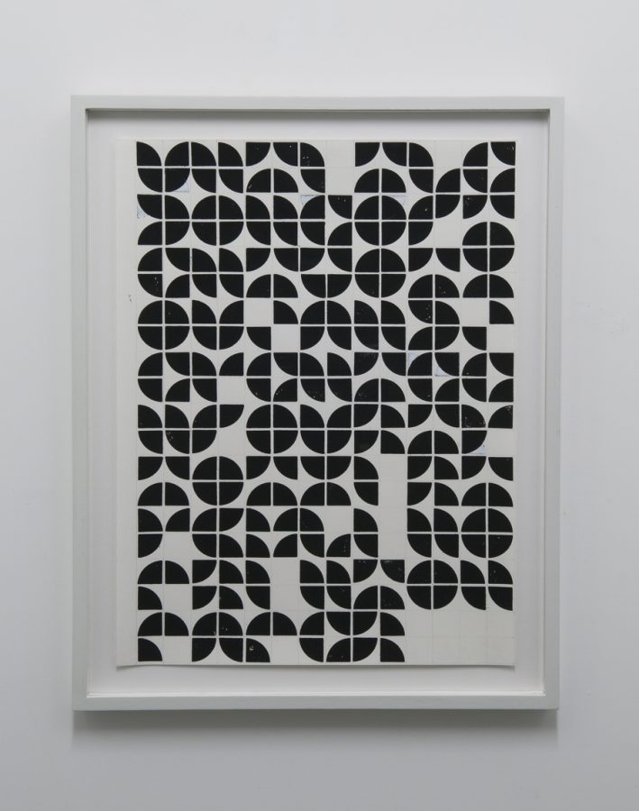
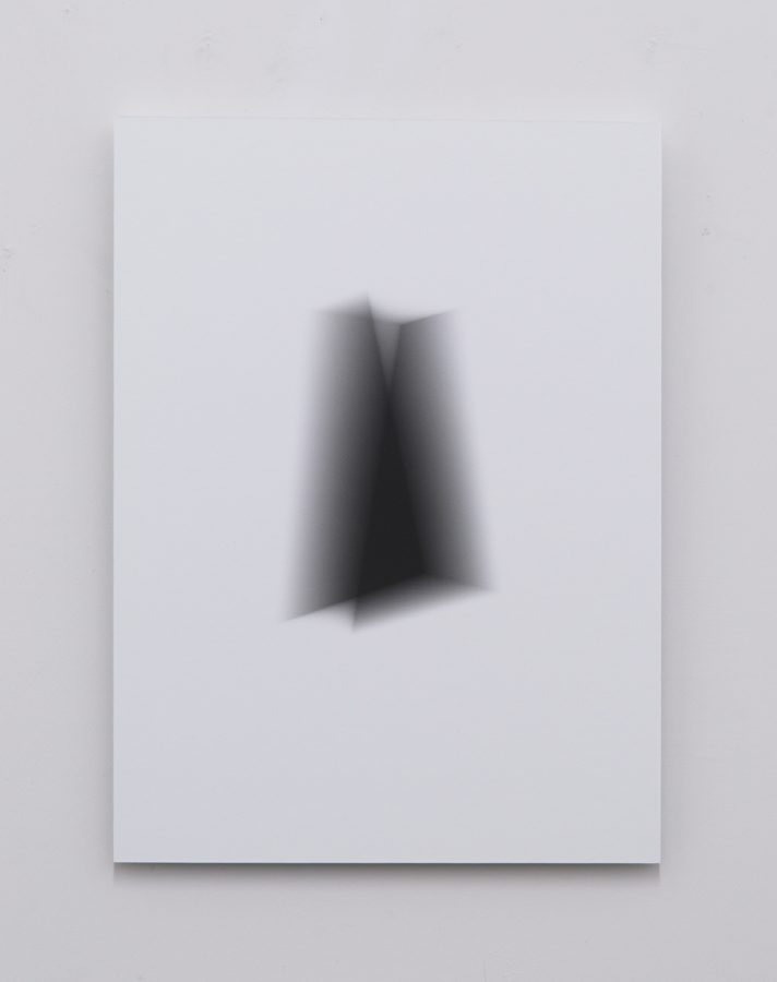
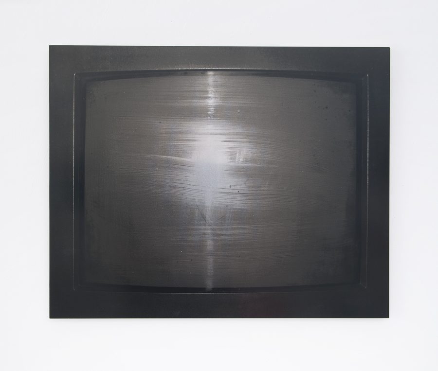
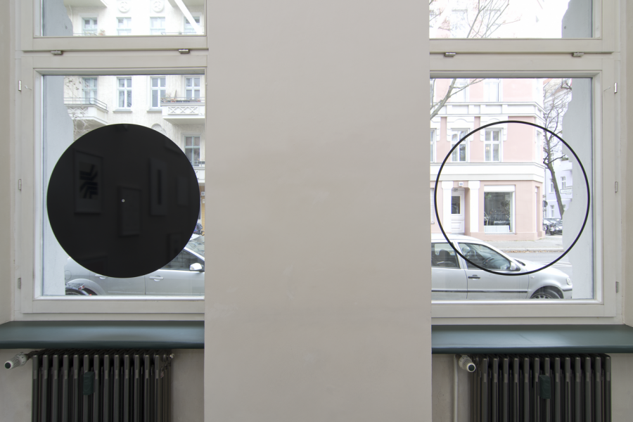
The concern about an almost familiar relationship, an immediacy between the work and the observer, the consideration of a mirror game reflecting individual memory and History of painting, led me to keep the „traditional“ tools. Among others: surface, color, frame.
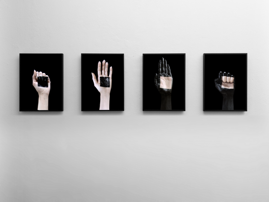
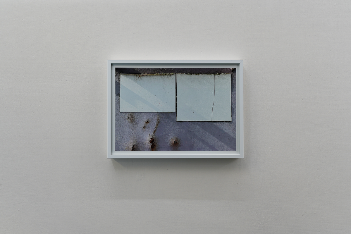
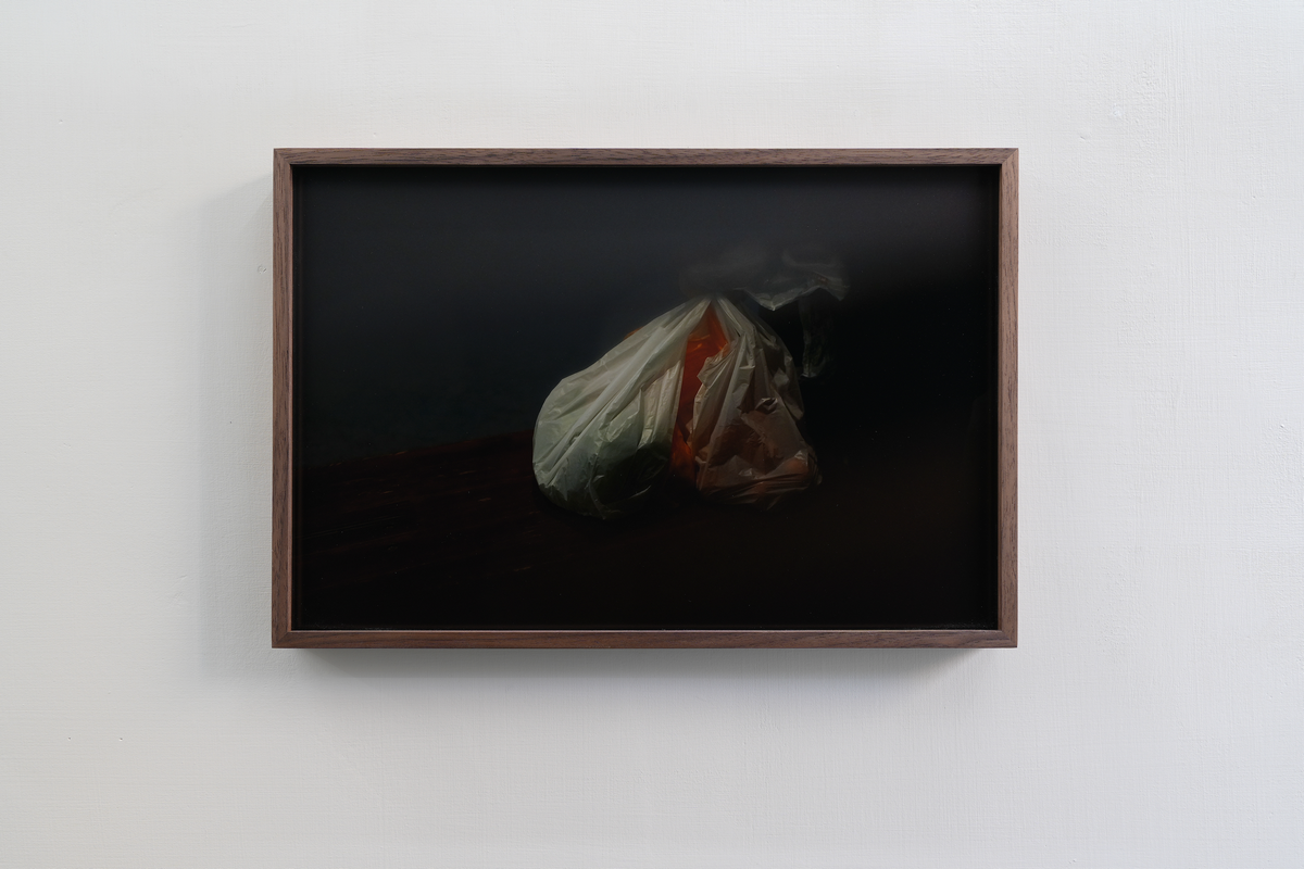
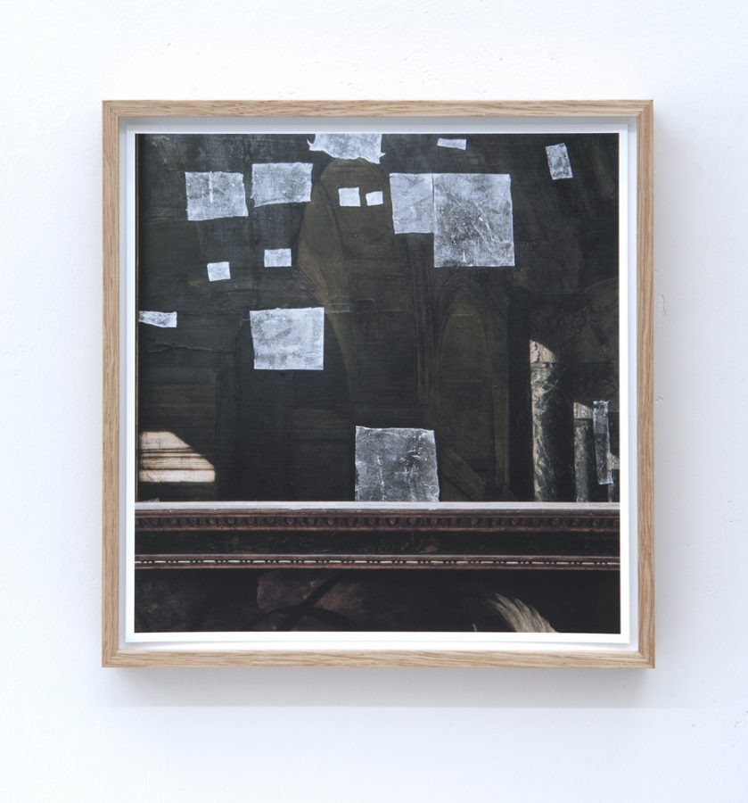
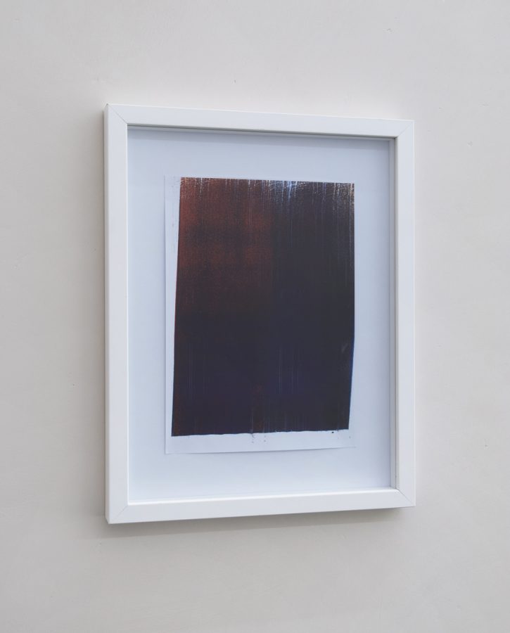
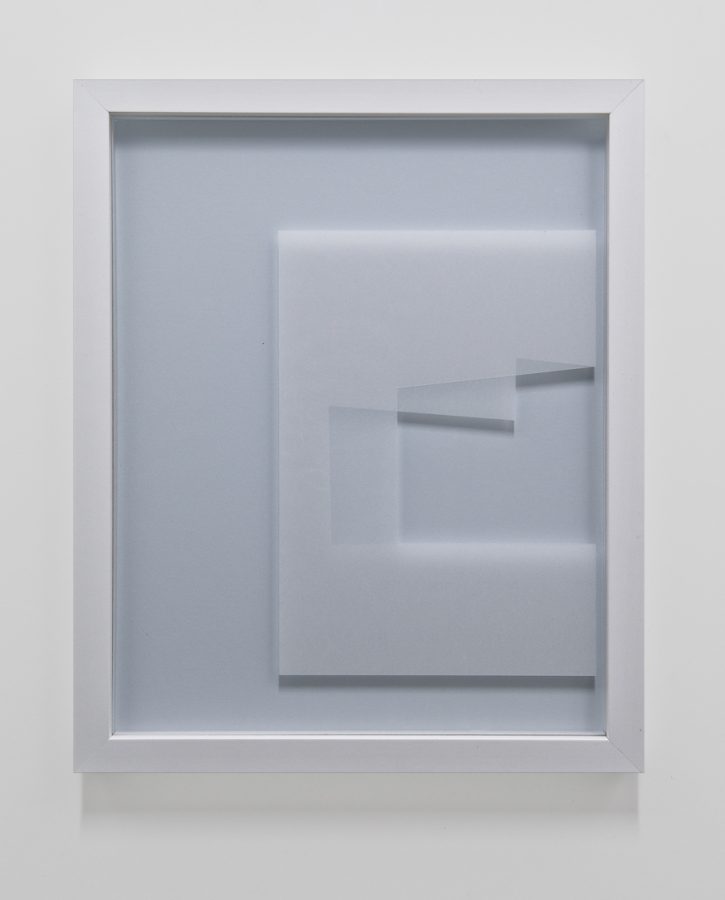
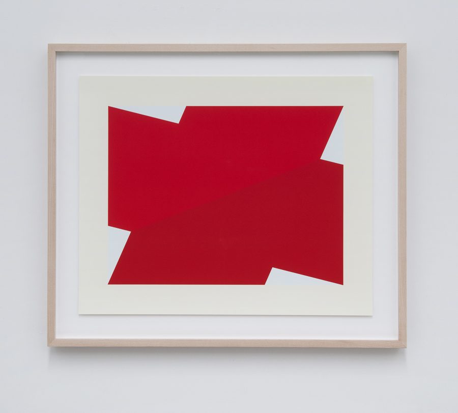
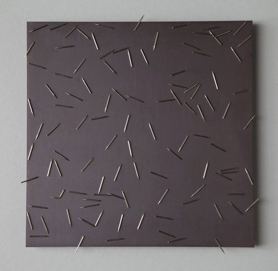
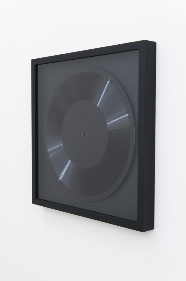
That said, it is obvious that only a criticism of these means can produce enough echoes to allow us to question their nature. The spatiality of some of my works, referring for example to Fontana, are the result of an attention paid to the materiality of the work: strips of canvas torn off, visible staples, stripping of the frame, reuse of the material, recovery, etc. These tools, these methods, these means, sometimes „crude and irreverent“, are above all means of access to the „individual personality“ of each painting, and not a specific interest for the support itself. I question perception by confronting imperfection with the idea of harmony, perfection or transcendence that we expect from an artistic work. In doing so, what might at first glance be considered unsightly, I look for the active principle of the changeable character of the image. The critical tension for me lies in this interplay between process-related incidents, which at best disrupts the conventional truth of the work of art in its ideality. I seek direct solutions, but without joining either a program that would make this the goal of the method.
In short, a critique of symbiosis between art and transcendence. The „abused“ work, sometimes bullied, paradoxically tends to join a certain quality of silence or solitude which could register it in a stream drifting from the Arte Povera wave, for example by reducing the number of pictorial procedures.
It also seems to me that there is perhaps an effect of resemblance, between these materials, their obviousness and their fragility, and our own fragile, mortal nature, and it is through this dialogue that my practice develops itself.

___DE___
Werkkommentar der Künstlerin

Die Beschäftigung mit einer fast vertraut wirkenden Beziehung, einer Unmittelbarkeit zwischen dem Werk und dem Betrachter, die Überlegung eines Spiegelspiels, das die individuelle Erinnerung und die Geschichte der Malerei reflektiert, hat mich dazu gebracht, die «traditionellen» Werkzeuge beizubehalten. Unter anderem: Fläche, Farbe, Rahmen.
Dabei ist es offensichtlich, dass nur eine Kritik dieser Mittel genug Widerhall erzeugen kann, um ihre Natur zu hinterfragen. Die Räumlichkeit einiger meiner Arbeiten, die sich z.B. auf Fontana beziehen, sind das Ergebnis einer Auseinandersetzung mit der Materialität des Werkes: abgerissene Leinwandstreifen, sichtbare Klammern, Ablösen des Rahmens, Wiederverwendung des Materials, Rückgewinnung, etc. Diese Werkzeuge, diese Methoden, diese Mittel, die mitunter „grob und respektlos“ sind, stellen vor allem einen Zugang zur „individuellen Persönlichkeit“ eines jeden Gemäldes dar und nicht ein spezifisches Interesse für den Träger selbst. Ich hinterfrage die Wahrnehmung, indem ich die Unvollkommenheit mit der Idee von Harmonie, Perfektion oder Transzendenz konfrontiere, die wir von einem künstlerischen Werk erwarten. Dabei suche ich in dem, was auf den ersten Blick als unansehnlich angesehen werden könnte, das aktive Prinzip eines veränderlichen Charakters des Bildes. Die kritische Spannung liegt für mich in diesem Wechselspiel zwischen prozessualen Ereignissen, das die konventionelle Wahrheit des Kunstwerks bestenfalls in seiner Idealität stören kann. Ich suche nach direkten Lösungen, ohne mich jedoch einem Programm unterzuordnen, das dies zum Ziel der Methode machen würde.
Kurzum, eine Kritik der Symbiose zwischen Kunst und Transzendenz. Das „missbrauchte“ Werk, das manchmal schikaniert wird, neigt paradoxerweise dazu, sich einer gewissen Qualität der Stille oder Einsamkeit anzuschließen, die es in einem von der Arte-Povera-Welle abdriftenden Strom einordnen könnte, zum Beispiel durch die Reduzierung der Anzahl der bildnerischen Verfahren.
Es scheint mir auch, dass es vielleicht einen Effekt der Ähnlichkeit gibt, zwischen diesen Materialien, ihrer Offensichtlichkeit und ihrer Zerbrechlichkeit, und unserer eigenen zerbrechlichen, sterblichen Natur, und es ist durch diesen Dialog, durch den sich meine Praxis entwickelt.


Sarah Smolders [BE]. language – parole, 2020


Relief print with oil based ink, 23 x 31 cm
(on Arches hot pressed cotton 300 g/m²)

Edition of 15 + 1
5 available

400 + 76 VAT = 476 €
+ frame 100 €


___EN___
On the work of the artist

Sarah Smolders handles the conditions in which space is created and experienced. To her, these conditions are both material and immaterial, and depart from the gaze and the body of the viewer that moves around in this space – including herself. Sarah Smolders uses painting as a language to set up a dialogue with specific places. By means of site-specific actions and gestures, walking the line between matter, architecture and painterly representations, she explores how time, movement, past and memory can express themselves spatially.

___DE___
Zur Arbeit der Künstlerin

Sarah Smolders beschäftigt sich mit den Bedingungen, unter denen Raum entsteht und erlebt wird. Diese Bedingungen sind für sie sowohl materiell als auch immateriell und gehen vom Blick und dem Körper des Betrachters aus, der sich in diesem Raum bewegt – auch von ihr selbst. Sarah Smolders nutzt die Malerei als Sprache, um einen Dialog mit spezifischen Orten zu etablieren. Mittels socher ortsspezifischer Aktionen und Gesten, die die Grenze zwischen Materie, Architektur und malerischer Darstellung überschreiten, erforscht sie, wie sich Zeit, Bewegung, Vergangenheit und Erinnerung räumlich ausdrücken können.

Anna Kubelík + Oliver Schmid [CH]


Wohl-Temperiertes Hygrometer III, 2021
12“ Dubplate mit Klangbild [A-Seite] und Soundperformance [B-Seite]

Hergestellt aus rotem, 2 mm starkem und transparentem Vinyl. Einzeln geschnitten in Audiophile Quality mit einem Feedback Schneidkopf auf der Neumann VMS66 Mastering Maschine: Hoch linearer Frequenzgang, sehr transparenter Sound, hervorragende Stereoabbildung.

In von der Künstlerin handgefertigter LP-Box aus Pappel-Sperrholz mit Magnetverschluss und vierseitiger Aufhängung für freie Positionswahl.
33,5 x 33,5 x 4,2 cm.
Edition 10 + 2 E.A. [7 verfügbar]

Preis inklusive Mp3-Version
800 + 152 = 950 €

Ewerdt Hilgemann [DE/NL]. Half Cube (Flying Object), 2020.


Two examples from a series of unique works.

Each stainless steel,
approximately
28 x 28 x 14 cm

both sold

Esther Stocker [IT]. Untitled, 2021.


Printed paper-aluminium foil, wood,

Creased sculptures from a series of uniquesworks.

Three approx. 35 x 35 x 15 cm
1.350 + 257 VAT = 1.607 € each

One in size approx. 42 x 42 x 14 cm
[white square pattern on black surface]
Sold


___EN___
On the work of the artist

Since 2015, the work and artistic position of Esther Stocker [born 1974, Silandro, Italy] have played a prominent role in the programme of drj art projects. Working within strict parameters, Esther Stocker deals in her painting with the phenomenon of the grid and with disruptions to it, thereby also thematizing the idea of order as a prerequisite of disorder. Proceeding from this focus, Esther Stocker has continually broadened her interests, ultimately expanding into the third dimension and realizing temporary spatial installations in international galleries and museums as well as permanent architectural interventions. Her interest in space and form has also resulted in sculptural objects.

The work group of her «Knitterskulpturen» [Creased Sculptures] is based directly on Esther Stocker’s main subject, the intensive exploration of grid, order, as well as their disturbances and relative effects. The development of this special type of sculpture is based on the interest in bringing a two-dimensional system into the third and spatial dimension through the process of crumpling. Originally, the artist photographed the resulting spaces and structures until she turned the inwardly deformed mediums back into an outwardly closed corpus, by turning them inside out. The work group meanwhile ranges from small wall-hanging formats to large-scale sculptures in public spaces.

Matthias Seidel, drj art projects

___DE___
Zur Arbeit der Künstlerin

Werk und künstlerische Haltung von Esther Stocker [*1974, Silandro, Italien] stehen im Programm von drj art projects seit 2015 an hervorgehobener Stelle. Innerhalb eng gesetzter Parameter bearbeitet sie in ihrer Malerei das Phänomen des Rasters und seiner Störungen, womit sie auch Ordnung als eine Bedingung von Unordnung thematisiert.
Ausgehend davon hat Esther Stocker ihre künstlerischen Interessen stets erweitert. In der Folge ist sie in die dritte Dimension vorgedrungen. So hat sie raumgreifende temporäre Installationen in internationalen Museen und Galerien sowie permanente architekturbezogene Interventionen realisiert. Auch plastische Objekte entstehen aus ihrem Interesse an Raum und Körper.

Die Werkgruppe ihrer Knitterskulpturen gründet direkt auf dem Hauptthema Esther Stockers, der intensiven Auseinandersetzung mit Raster, Ordnung, sowie deren Störungen und Relativierungen. Die Entwicklung dieser speziellen Form von Plastiken geht dabei auf das Interesse zurück, ein zweidimensionales System durch den Prozess des Zerknitterns in die dritte, räumliche Dimension zu bringen. Ursprünglich hielt die Künstlerin die sich ergebenden Räume und Strukturen fotografisch fest, bis sie aus den nach innen verformten Bildträgern, durch das Umstülpen, wieder einen äußerlich geschlossenen Körper entstehen ließ. Die Werkgruppe reicht mittlerweile von kleinen wandhängenden Formaten bis zu Großplastiken im öffentlichen Raum.

Matthias Seidel, drj art projects

Esther Stocker + Flora Miranda. Mund- Nasenschutz, Alltagsmaske, 2020


Baumwolle, Elasthan
Unisex, Einheitsgröße

[Sold out]

„Esther Stocker + Flora Miranda. Mund- Nasenschutz, Alltagsmaske, 2020“ weiterlesen

Yasuaki Kuroda [JP]. text + ure, 2020.


Naturally dyed silk threads on wood panel.
Series of unique works

Sold out.

666 EUR [560 + 106 VAT]

Gerhard Frömel [AT]. Schöneberger Quadrat, 2016

Metallstab Ø 8 mm, Acryllack, 37,5 x 37,5 x 4 cm
Ed. 12

952,00 EUR [800,00 +152 VAT]

Lara Faroqhi [DE] Hinterhof I – VI, 2020


Series of six works.

Size 14,5 x 18,5 cm each.
All gouache, oil, coloured pencil, wax crayon tracing on paper.
Signed and titled on verso.
Framed in a white painted maple frame with spacer bar.

810 EUR [680 + 130 VAT]

Monika Brandmeier [DE]. Floating six, 2017.

Oil on waxed paper,
28 x 24 cm.
Ed. 5 [+ 2 EA]
Only one example, 5/5 available

Sold out

Hartmut Böhm [DE]. O.T., 2017.


White Perspex, photography, cardboard,
21 x 14, 8 x 0,8 cm.
Ed. 15 + 2 EA

700,00 net, unframed

Recommended in all-side transparent acrylic glass frame, price on request

Dieter Balzer [DE]. Pixel (5w4s), 2017.

MdF, color foil,
18,3 x 18,3 x 6,5 cm.
Ed. 12, 7 available

904,40 [760,00 + 144,40 VAT]

Anna Kubelik [CH]. Fuge I, 2016.

birch plywood / folding technique,
17 x 11,5 x 2 cm.
Series of 6 motives

654,50 [550,00 + 104,50 VAT]

Susan York [US]. Violet: Yellow Reflection, 2017.

Double Sided Silkscreen,
12 x 12 cm.
Six complimentary color series of 25

833,00 [700,00 + 133,00 VAT]. Frame + 100
Price progression 2 – 5 each + 50 net, 11 – 25: 950 net.

Regine Schumann [DE]. color soft transparent berlin, 2017.

Fluorescend acrylic glass,
9 x 9 x 9 cm.
Ed. 6

sold out

Stephan Ehrenhofer [AT]. Eyelets, 2017.

Coconut fiber, Polypropylen,
30 x 30 x 1,5 cm.
Ed. 5 + 1 EA

499,80 [420,00 + 79,80 VAT]

José Heerkens [NL]. Color Formation X21 + X22, 2017.

Oil on plywood,
20 x 25 x 2,7 cm.
Two series [a+b] of 5 uniques works + 1 EA

773,50 [650,00 + 144,50 VAT] each

Set of two
1.309 [1.100 + VAT]
instead of 1.547 [inc. VAT]

Peter Weber [DE]. Faltobjekte Filz, 2017. 3 Variationen


Red and purple felt, folded,
20 x 20 cm [Yellow unavailable]

Each variation consists of two series of single works [a+b] in an Edition of 6

Price for each single work
1.000 € [841 + 159 VAT]

Gerhard Frömel [AT]. Wandobjekt o.T. 2008/2016.

Aluminium, acrylic laquer,
37,5 x 18,7 x 4 cm.
Ed. 6

1.200 € [1.008 + 192 VAT]

Wolfgang Berndt [DE]. r1704.03#1/12 – #12/12, 2017.

Pigmented ink on Hahnemühle Baryta 325 gr,
21 x 21 cm.
Series of 12 unique graphics
119,00 [100,00 + 19,00 VAT]. Frame + 20

Price progression 4 – 6, 7 – 9, 10 – 12: each group + 25 net.

Willem Besselink [NL]. Cut Out Line Panel, 2017.

Laser cut acrylate,
35 x 35 cm.
Ed. 10 + 1 EA

892,50 [750,00 + 142,50 VAT]

Robert Gschwantner [AT]. RI/II, 2017.

Pvc tubes, seawater, mixed media,
25 x 20 x 4 cm.
Series of 5 uniques works

Only two works still available
1044,00 [900,00 + 144,00 VAT]

Carlo Battisti [IT]. Puzzle, 2017.


Print on Conqueror paper on paper board, glued, hand cut and boxed,
text box 25 x 25 cm ,
box 19 x 27 x 4,5 cm
puzzle finished 225 pieces
Ed. 5 + 1 EA

535,50 [450,00 + 85,50 VAT]

Carlo Battisti [IT]. La Biblioteca di Babele, 2017.

Carlo Battisti [IT]. La Biblioteca di Babele, 2017.

Print cut and fold on Conqueror paper,
25 x 25 cm.
Ed. 5 + 2 EA

952,00 [800,00 + 152,00 VAT]. Frame incl.
Price progression 4 + 5: net 900

Hansjörg Schneider [DE]. Gästehaus, 2017.

Etching on handmade paper,
44 x 27 cm.
Ed. 5 in white + 5 in black ink + 2 EA

654,50 [550,00 + 104,50 VAT]

Gilbert Hsiao [US]. Sylvester (Queen of Disco), 2017.

Painted Vinyl and Sequins on Vinyl,
25 x 25 cm.
Ed. 12

595,00 [500,00 + 95,00 VAT]

Douglas Allsop [GB]. 31 vertical lines, 5 horizontal bars, 2016.

Digital print on archival paper,
42 x 29,7 cm. Ed. 20

1.071 € [950 + 171 VAT]. Frame + 120

Anette Haas [DE]. Lineaturen [KellerMitteDach], 2017/20.


Screenprints on handmade Paper,
33,3 x 42 cm.
Ed. 5

297,50 [250,00 + 47,50 VAT]